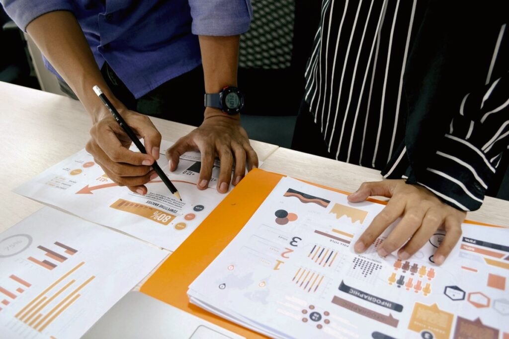
When you work on complex, fast-moving projects — especially with cross-functional or remote teams — you’ll often hit a wall of information chaos. Sticky notes, chat logs, brainstorming sessions, conflicting ideas. It’s overwhelming. That’s where the Affinity Diagram comes in.
Sometimes called the KJ Method (after its creator, Jiro Kawakita), the Affinity Diagram is a time-tested technique to organize large amounts of data, opinions, or insights into meaningful categories. It’s especially useful when ideas are diverse, scattered, or emotionally charged.
What Is an Affinity Diagram?
An Affinity Diagram is a tool that helps teams group related ideas or information into clusters based on their natural relationships. It makes patterns visible, supports collective thinking, and helps teams move from chaos to clarity.
Unlike a mind map, which radiates from a central idea, an affinity diagram reveals structure from within the data itself. It’s bottom-up organization, not top-down.
When Should You Use It?
Affinity diagrams are ideal for:
- Post-brainstorming idea synthesis
- Organizing user research or survey results
- Retrospectives or lessons learned sessions
- Mapping stakeholder feedback
- Complex problem-solving or root cause analysis
- Defining requirements from unstructured input
I frequently use this method when kicking off digital transformation initiatives, especially where input is coming from multiple departments with competing priorities.
The Process: How to Build an Affinity Diagram
- Gather Input
Collect raw data or ideas. These might come from workshops, surveys, interviews, retros, or brainstorms. Each idea should be on a separate sticky note or card. - Display the Data
Lay out all the inputs where everyone can see them — on a wall, whiteboard, or virtual board (like Miro or MURAL). - Silent Grouping
Team members silently move the notes into clusters based on perceived relationships. No discussion yet. This prevents early bias and groupthink. - Discuss and Refine
Once initial groups emerge, the team discusses what each cluster means. You can split or merge groups as clarity increases. - Label the Categories
Agree on a short, descriptive label for each cluster. These become your themes. - Extract Insights
Reflect on what the structure tells you. Are there dominant concerns? Gaps? Surprises? These themes can inform roadmaps, user stories, improvement plans, etc.
Why It Works
Affinity Diagrams tap into our natural pattern recognition without forcing consensus too early. Benefits include:
- Encouraging equal participation
- Revealing hidden connections
- Reducing cognitive overload
- Creating shared understanding
- Turning scattered inputs into strategy
For remote teams, virtual whiteboards make this method easy to run asynchronously or across time zones.
Tips for Project Managers
- Limit group size to 5–8 for interactive clustering. Larger teams can work in breakout groups.
- Timebox the silent sorting phase to keep energy high.
- Use color coding for different sources or departments.
- Capture a photo or export the board to document the results.
- Revisit themes as the project evolves. Affinity diagrams can support multiple iterations.
Real-World Applications
- Agile retrospectives: Cluster team feedback to identify key action areas.
- User interviews: Categorize pain points or feature requests.
- Root cause analysis: Group causes before applying tools like the 5 Whys.
- Process improvement: Synthesize frontline insights before redesign.
- Change impact analysis: Organize potential stakeholder concerns.
Final Thoughts
The Affinity Diagram isn’t flashy. It doesn’t require advanced software. But it’s one of the most powerful tools for taming complexity and building shared meaning. In a world flooded with data and opinions, project managers need ways to listen better, think together, and act with purpose.
Next time your project feels noisy, fragmented, or unclear, try building an affinity diagram. You might be surprised what emerges when you let the patterns speak for themselves.


