Introduction: Why Everything Doesn’t Deserve Equal Attention
In project management—especially in logistics, manufacturing, and operations—resources are always limited. Whether it’s time, manpower, or budget, we can’t afford to address every problem with equal intensity. That’s where the Pareto Principle—often visualized through a Pareto Chart—comes in.
The principle is simple: 80% of effects come from 20% of causes. In project terms, that means a few recurring issues are likely responsible for most delays, defects, or cost overruns. Identifying these is the first step toward true optimization.
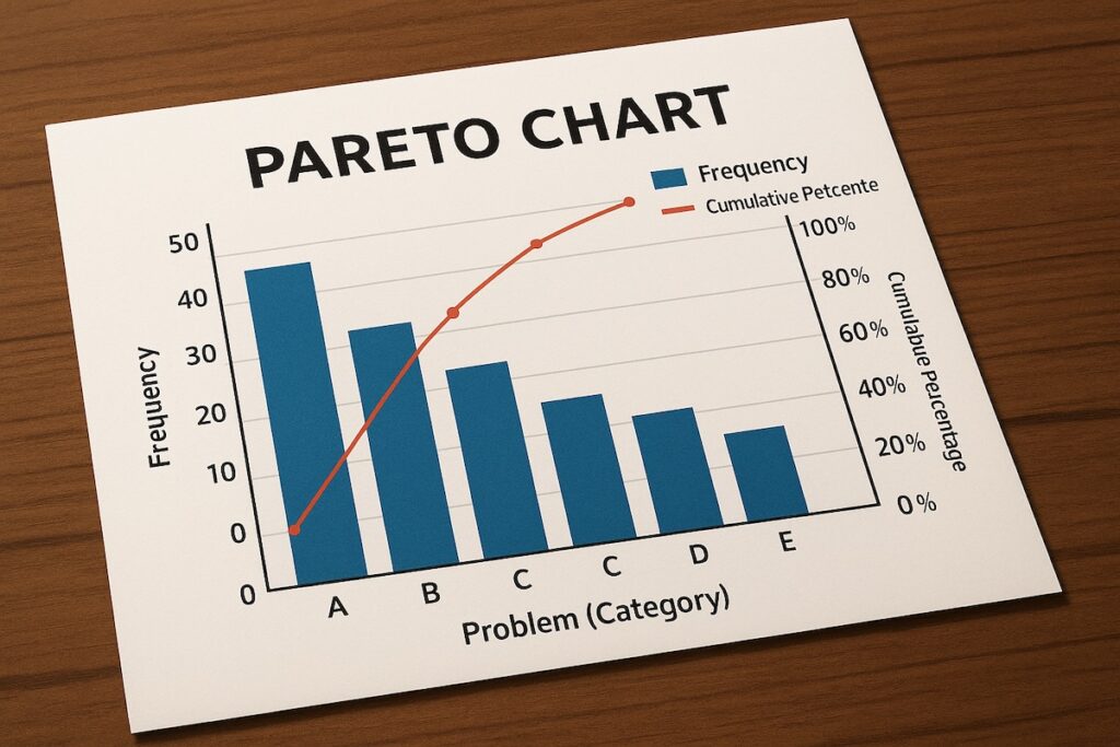
What Is a Pareto Chart?
A Pareto Chart is a combination of a bar graph and a line graph:
- The bars show the frequency or impact (e.g., number of defects, hours of delay, cost incurred) of various problems or causes.
- The line represents the cumulative percentage—helping visualize which problems are the most significant.
It’s not just a chart—it’s a decision-making tool that helps teams prioritize efforts where they matter most.
Real-World Use Case #1: Reducing Delivery Delays in a Logistics Project
Context:
At a large-scale distribution center in Texas, my team was struggling with chronic delays in outbound deliveries. Everyone had theories: system glitches, untrained drivers, road traffic, missing inventory.
Approach:
We tracked every delay event over six weeks and categorized them by cause.
Results (sample data):
- Inventory not picked in time: 42 events
- System outages: 16 events
- Driver no-show: 13 events
- Traffic delays: 9 events
- Wrong labels: 7 events
- Miscellaneous: 13 events
Pareto Chart Analysis:
We plotted the data and found that “inventory not picked in time” accounted for over 50% of total delays. Tackling this single issue could halve our overall problem.
Action Taken:
We introduced buffer zones, early picking windows, and shift overlaps for pickers. Within a month, delivery delays dropped by 38%—with no need to overhaul the whole system.
Real-World Use Case #2: Quality Control in Manufacturing
Context:
In a packaging plant, defect rates were rising, impacting customer satisfaction. The QA team listed 12 different defect types, but budget only allowed for solving a few.
Solution:
A Pareto analysis revealed that just 3 defect types (glue failures, print smudges, and seal misalignment) were responsible for 76% of all customer complaints.
Outcome:
By redesigning adhesive application methods and retraining printing operators, defect rates dropped significantly—without touching the other 9 issues.
How to Apply a Pareto Chart in Your Projects
Step 1: Define the Problem Clearly
Pick one measurable project issue:
- Delays
- Defects
- Cost overruns
- Change requests
- Support tickets
Step 2: Collect and Categorize Data
Gather data over a fixed period. Each record should include:
- A cause/category
- A unit of measurement (e.g., time, frequency, cost)
Use Excel, Google Sheets, or project management tools that support custom reporting.
Step 3: Tally the Frequency or Impact
Sum up how often each issue occurred or how much impact (e.g., dollars lost, time wasted) it had.
Step 4: Sort and Calculate Cumulative Percentages
Rank categories from most to least significant. Then calculate the cumulative percentage for each.
Step 5: Build the Pareto Chart
Tools:
- Excel: Use the built-in “Combo Chart” feature.
- Power BI or Tableau: Offers more flexibility with visuals.
- Wrike, Jira, or Asana (with plugins): Some allow embedded Pareto reporting.
Step 6: Interpret and Act
Focus on the left side of the chart—these are the vital few. Decide what’s actionable with your current budget and resources.
Best Practices from the Field
- Use it in retrospectives: After a sprint or phase, categorize blockers and pain points.
- Avoid over-slicing data: If you break problems into too many subcategories, you’ll lose clarity.
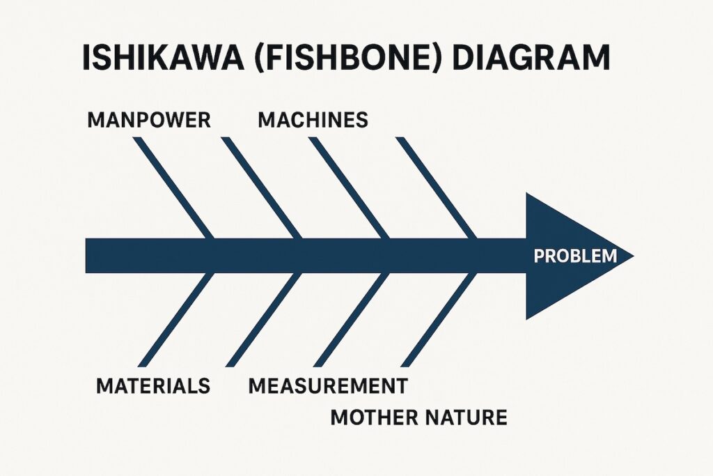
- Combine with Root Cause Analysis: A Pareto Chart tells you what is big. Use 5 Whys or Fishbone diagrams to understand why.
- Revisit regularly: New dominant issues often emerge after the first set is solved.
Final Thoughts: What You Don’t Fix May Not Matter
The value of the Pareto Chart is not just in visualization—it’s in focus. It frees you from trying to fix everything. In operations-heavy projects, chasing perfection is a trap. Excellence often lies in fixing the right 20%.
In project environments driven by scale, complexity, and KPIs, the Pareto Chart remains one of the most cost-effective and intuitive tools I’ve ever used.